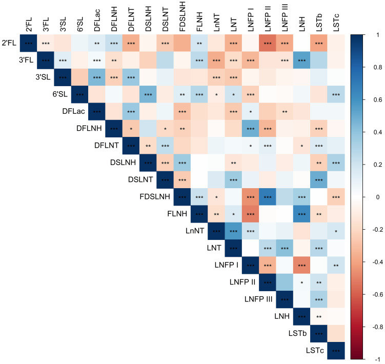
Figure 1.
Heatmap showing Spearman correlations among HMO concentrations. Blue shading indicates positive Spearman correlation and red shading indicates negative Spearman correlation; color saturation indicates the strength of the correlation. Stars indicate statistical significance, with *** showing correlations with P < 0.001, ** showing correlations with P < 0.01, and * showing correlations with P < 0.05.

