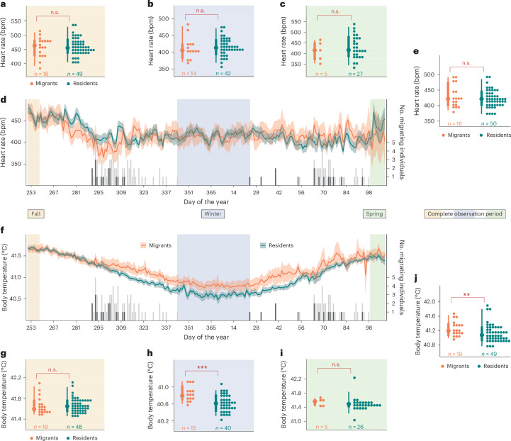
Fig. 2. Temporal comparison of fH and Tb between overwintering strategies with depicted individual migration events.
a–j, The mean fH (a–e) and Tb (f–j) over time (d and f) and during distinct time periods (a, b, c, e and g–j) are displayed for both wintering strategies with 95% confidence intervals. The black/grey histograms mark the number of individuals migrating each night: the black bars depict the number of individuals on their first night of migration and the grey bars show the number of individuals on subsequent migration nights (right y axis). The ochre time frame in the first week of the experiment highlights the fall period that precedes the initial departures by at least 30 days. The middle blue area between the last fall migration event and the first spring migration marks the core winter period, while the green marked period defines the spring period, which starts with the return of the last migrant to the breeding area. The dots mark individual means in fall for a and g, winter for b and h, spring for c and i and the whole timeframe for e and j, next to the coloured bars showing distribution within each wintering strategy (mean, and 75% and 25% percentiles). Sample sizes are shown below each group. Significant differences, derived from a linear mixed model with Bonferroni correction (Supplementary Table 1 and Supplementary Results) are indicated by asterisks: ***P < 0.001, **P < 0.01, *P < 0.05 and ‘non-significant (n.s.)’ where P > 0.05.

