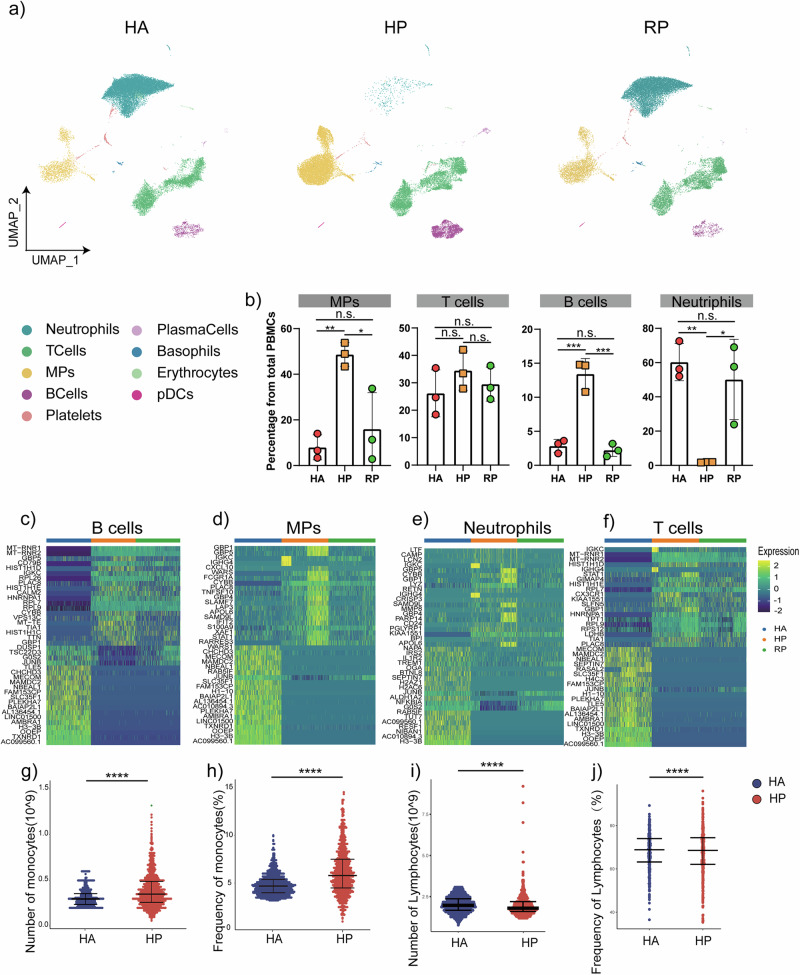
Fig. 2. An overview of NK and T, B, and myeloid cells in the blood of three groups.
a The UMAP plot shows a comparison of the clustering distribution across HCs as well as herpes zoster patients (HP) and herpes zoster patients (RP) patients. b The bar plot shows the relative contributions of eight subpopulations by samples, including three HAs, three HP patients, and three RP patients. c The box diagram shows the percentages of myeloid, NK and T, and B cells across the three groups. d The heatmap shows the DEGs of B cells among the HAs, herpes zoster patients (HP) and herpes zoster patients (RP) patients. e The heatmap shows the DEGs of MPs among the HAs, herpes zoster patients (HP) and herpes zoster patients (RP) patients. f The heatmap shows the DEGs of neutrophils among the HAs, herpes zoster patients (HP) and herpes zoster patients (RP) patients. g The heatmap shows the DEGs of T cells among the HAs, herpes zoster patients (HP) and herpes zoster patients (RP) patients. h–k Blood routine analysis of the numbers and frequencies of monocytes and lymphocyte from HA and herpes zoster patients. Unpaired t-test were used and the data represent the means ± SEM. ***P < 0. 001, ****P < 0. 0001.

