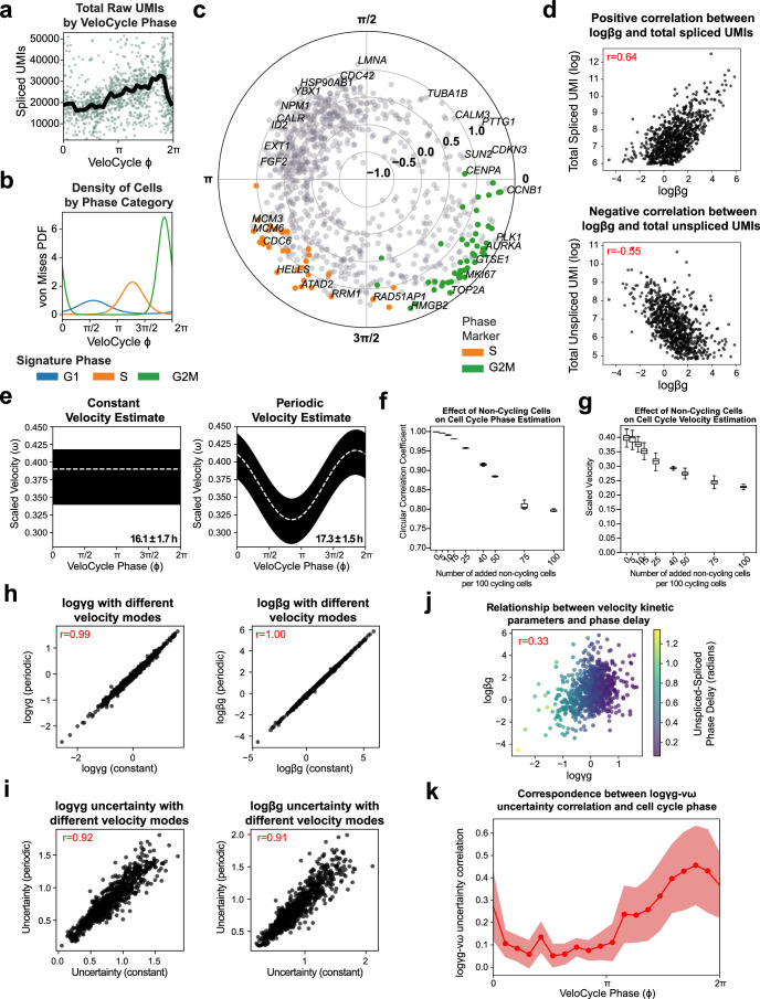
Extended Data Fig. 4. VeloCycle coupled with live-cell imaging of human fibroblasts enables experimental validation of cell cycle speed.
(a) Scatter-plot of total raw spliced counts by cell cycle phase estimated with VeloCycle for dHF40. Black line indicates the binned mean. (b) Probability density plot along the VeloCycle phase estimate for cells in (a), stratified by categorical assignment. (c) Polar plot indicating phase of peak expression and amplitude for 876 cycling genes. Each dot represents a gene; genes colored orange (S) or green (G2M) represent marker genes used in categorical assignment26. (d) Scatter-plots of the gene-wise relationship among splicing rate and un/spliced counts. (e) Posterior estimate plot of constant (left) and periodic (right) velocity estimates obtained for data in (a) using a medium-sized gene set37. (f) Box plots of circular correlation coefficients between phase with varying proportions of non-cycling cells and phase with only cycling cells (from a-c). Contaminant cells were taken from non-cycling cell types, as annotated in the original study40. (g) Box plots of scaled velocity posterior estimates with varying proportions of non-cycling cells. The box plots in (f) and (g) indicate the results across three independently sampled subsets of non-cycling cells. (h) Scatter-plots of degradation rates (left) and splicing rates (right) obtained using either constant (x-axis) or periodic (y-axis) models of velocity estimation. (i) Scatter-plots of degradation (left) and splicing (right) rate posterior uncertainties obtained from 500 posterior samples using either constant (x-axis) or periodic (y-axis) models. (j) Scatter-plot of the degradation and splicing rates obtained with the SVI + LRMN model. Gene-wise dots are colored by the un/spliced phase delay. (k) Binned plot of Pearson’s correlation coefficients between gene-wise degradation rate and velocity posterior uncertainties on dHF using the SVI + LRMN model. The solid red line indicates binned mean delay; the red bands indicate one standard deviation. Pearson’s correlations coefficients are indicated in red text in (d-e) and (h-i). Boundaries in (f) and (g) are defined by the interquartile range (IQR), and whiskers extend each box by 1.5x the IQR.

