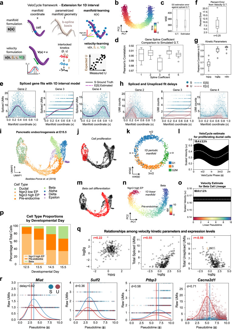
Extended Data Fig. 8. Evaluation of a 1D interval model for manifold-constrained RNA velocity in simulated data and during pancreatic endocrinogenesis.
(a) Schematic of the 1D interval manifold model, where variation in gene expression along the manifold is estimated using B-splines instead of a Fourier series (as in VeloCycle). (b) PCA plot of two principal components colored by the manifold coordinate used (time). (c) Box plots of log mean squared error (MSE) for expected spliced counts (ES) compared to simulated raw data (S). MSE was calculated using either simulated ground truth (GT) or estimates recovered by the non-periodic manifold-constrained model (Estimated). (d) Box plots of the Pearson’s correlation coefficient between estimated B-spline coefficients and GT. (e) Scatter-plots of spliced gene expression fits along the 1D interval manifold. The solid black line indicates GT; the red dashed line indicates the estimate obtained during manifold learning. (f) Box plot of percent error for the velocity estimate compared to GT (0.25; min: 0.7%, max: 20.0%, median: 4.7%). (g) Box plot of Pearson’s correlation coefficients between estimated and GT for kinetic parameters. (h) Scatter-plots of spliced (blue) and unspliced (red) gene expression fits obtained by the model. (i) UMAP of mouse E15 pancreas63, colored by published cell types. (j) UMAP of dataset in (i), colored by selected cell subsets (red) extracted to estimate cell cycle velocity (Ductal). (k) Low-dimensional plot of the cell cycle manifold estimated with VeloCycle. (l) Posterior estimate plot of cell cycle speed from VeloCycle. (m) UMAP of dataset in (i), colored by selected cell subsets (red) along the beta cell differentiation lineage (Ngn3 high EP, Pre-endocrine, Beta). (n) PCA plot of beta differentiation manifold obtained with diffusion pseudotime on the principal components. (o) Velocity posterior estimate plot obtained for beta differentiation using the 1D interval model. (p) Stacked bar plot of cell type proportions along the differentiation axis in four datasets from the original study. (q) Scatter-plots demonstrating the relationship between the kinetic parameters (logγg, logβg) and total (spliced, unspliced) counts. Pearson’s correlation coefficients are indicated in red. (r) Scatter-plots of selected genes, illustrating the estimated expected spliced (blue dashed line; ES) and unspliced (red dashed line; EU) levels along the cell cycle manifold, compared to the measured spliced (blue; S) and unspliced (red; U) counts. In (a-h), all analyses were performed across ten simulated datasets with 3,000 cells and 300 genes (see Fig. 2). In (l) and (o), the white line indicates the mean over 200 posterior samples; the black line indicates the full posterior interval. The cell cycle period (l) and beta cell differentiation process time (o) are indicated at the top left of the respective plots. For each box plot in (c-d) and (f-g), the black horizontal line represents the median; boundaries are defined by the interquartile range (IQR), and whiskers extend each box by 1.5x the IQR.

