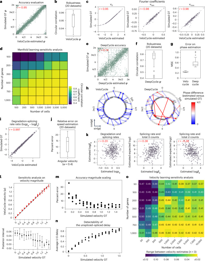
Fig. 2. Sensitivity analysis of VeloCycle on simulated data.
a, Scatterplot of cell cycle phase assignment (estimated) compared to the simulated ground truth (GT). b, Box plot of circular correlation coefficients (min, 0.932; max, 0.963; median, 0.957) between estimated and GT phases. c, Scatterplots of estimated and GT values for gene harmonic (Fourier) coefficients (v0, v1sin, v1cos) using the dataset in a. d, Heatmap of the mean circular correlation coefficient between estimated and GT phases computed with varying numbers of cells and genes (average of three simulations). e, Scatterplot of cell cycle phase estimation obtained by DeepCycle compared to GT using the dataset in a. f, Box plot of circular correlation coefficients (min, 0.416; max, 0.851; median, 0.788) between DeepCycle-estimated and GT phases across the datasets in b. g, Box plots of per-cell MSE for phase estimation with VeloCycle (min, 0.22; max, 0.29; median, 0.23) and DeepCycle (min, 0.43; max, 1.03; median, 0.53) across 20 simulations. h, Polar plots representing the phase difference between estimated (Est.) and simulated GT for 30 randomly chosen cells from one simulated dataset using VeloCycle (left) and DeepCycle (right). Each dot represents a cell, and lines connect the estimated phase assignment (light gray) to simulated GT (dark gray). i, Scatterplot of estimated kinetic ratio compared to simulated GT for 300 genes. j, Box plot of percent error (min, 2.0; max, 23.0; median, 14.5) between estimated and GT velocity (ω = 0.4). k, Scatterplots illustrating the recovered relationships among splicing rate (logβg), degradation rate (logγg), spliced counts and unspliced counts for 300 simulated genes. E[log l, Top: scatterplot of estimated and GT estimates for 16 different simulated velocities between 0.0 to 1.5 rpmh for four simulations. Bottom: point plots with s.d. of posterior uncertainty intervals corresponding to above simulations. The black dot for each plot represents the mean posterior interval across four simulations; error bands indicate 1 × s.d. m, Scatterplot of percent error between estimated and GT velocity across conditions in l. n, Scatterplot of mean unspliced–spliced expression delay across conditions in l. o, Sensitivity analysis heatmap of the range among velocity estimates for three independent simulations, using varying numbers of cells and genes. The text value in each box represents the mean velocity over the three datasets and heatmap intensity represents absolute range. The Pearson’s correlation coefficient (r) over 20 individual simulated datasets is indicated in red (a,c,e,i,k). Each green dot represents a single gene (a,e). Each purple dot represents a single gene (c,i,k). Box plot bounds (b,f,g,j) are defined by the interquartile range (IQR); whiskers extend each box by 1.5× IQR.

