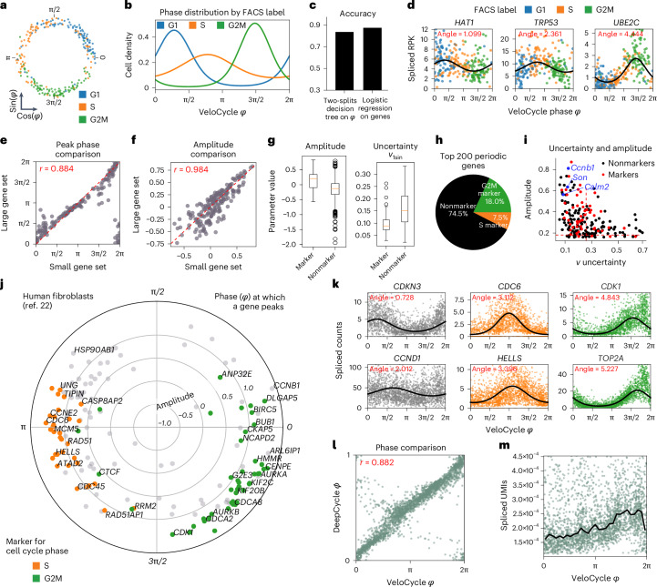
Fig. 3. Manifold learning and gene periodicity on different datasets and technologies.
a, Scatterplot of phase assignment for 279 mES cells, colored by FACS-sorted categorical phase33. b, Density plot for FACS-sorted labels across VeloCycle-assigned phases. c, Bar plot reporting categorical phase predictor obtained using a two-threshold decision tree trained on VeloCycle phase estimates alone versus a logistic regression classifier trained on the entire expression matrix. d, Representative scatterplots of genes fits. Curved black lines indicate a gene-specific Fourier series obtained with manifold learning. The ‘peak’ indicates the position of maximum expression along the cell cycle manifold (φ). e,f, Scatterplot of gene-wise peak position (e) and amplitude (f) using a small (x axis) or large (y axis) gene set during manifold learning. g, Left: box plot of gene-wise amplitude for 1,358 marker (min. −0.56; max, 0.84; median, 0.18) and nonmarker (min: −1.5; max, 0.80; median, −0.13) genes. Right: box plot of harmonic coefficient uncertainties for marker (min, 0.03; max, 0.25; median, 0.09) and nonmarker (min, 0.02; max, 0.31; median, 0.15) genes. h, Pie chart of categorical composition for the 200 periodic genes with greatest amplitude. i, Scatterplot of gene-wise total harmonic coefficient (ν) uncertainty and amplitude. Gene dots are colored as standard ‘markers’ or ‘nonmarkers’. Red dashed lines represent mean values for markers. j, Polar plot of estimated gene harmonics for human fibroblasts32. Each dot represents a gene (n = 160). The position along the circle represents the phase of maximum expression, and distance from the center represents total amplitude. Colored genes (orange/green) are those used to compute a standard cell cycle score with scanpy26 or Seurat27. k, Selected scatter-plots of genes fits for early (CDKN3, CCND1), mid (CDC6 and HELLS) and late (CDK1 and TOP2A) cell cycle markers. l, Scatter-plot of VeloCycle-estimated phases compared to DeepCycle. Circular correlation is indicated in red. m, Scatter-plot of total raw spliced UMI counts by VeloCycle phase. Black lines indicate binned mean UMI level. Box plot bounds in b,f,g,j are defined by the interquartile range (IQR); whiskers extend each box by 1.5× the IQR.

