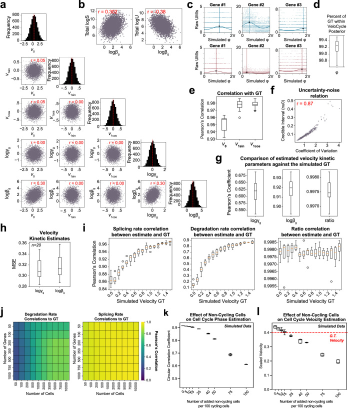
Extended Data Fig. 2. Data generated with simulations assists in VeloCycle validation.
(a) Scatter-plots of correlation between gene harmonics coefficients (ν0, ν1sin, ν1cos) and kinetic parameters (logβg, logγg) in the ground-truth (GT) from simulated data. Diagonal: histograms for each simulated latent variable. (b) Scatter-plots of simulated data correlations among splicing rate (logβg), spliced (logS), and unspliced (logU) counts. (c) Scatter-plots of simulated gene fits for spliced (blue) and unspliced (red) counts. Solid curved lines represent gene fits; vertical lines indicate peak expression. (d) Box plot of the percent of GT phases within the uncertainty interval estimated (min: 98.6%, max: 99.5%, median: 99.25%), across 20 simulated datasets. (e) Box plots of the mean circular correlation coefficient, across 300 genes, for ν0 (min: 0.93, max: 0.96, median: 0.96), ν1sin (min: 0.96, max: 0.99, median: 0.98), and ν1cos (min: 0,97, max 0.99, median: 0.98) estimated by VeloCycle compared to the GT. (f) Scatter-plot of gene-wise coefficient of variation (a measure of noise) and credible interval obtained for ν0. (g) Box plots of the mean Pearson’s correlation coefficient between estimated and GT gene-wise values for degradation rate (logγg; min: 0.54; max: 0.69; median: 0.62), splicing rate (logβg; min: 0.89; max: 0.94; median: 0.92), and kinetic ratio (logγg-logβg; min: 0.996; max: 0.998; median: 0.997), across 20 simulated datasets. (h) Box plots of mean squared error (MSE) for logγg and logβg against the GT for data in (g). (i) Box plots of mean Pearson’s correlation coefficient between estimated and GT values for logβg, logγg, and kinetic ratio, for all genes across four simulations with 16 different velocity GT between 0.0 and 1.5. For each box plot, the orange horizontal line represents the median across four datasets. (j) Heatmaps showing the correlation between estimated and GT values for the kinetic parameters using varying numbers of cells and genes. (k) Box plots of the circular correlation coefficient between estimated and GT phase across three simulated datasets with varying proportions of non-cycling cells (from 0 to 100 non-cycling cells per 100 cycling cells). (l) Box plots of scaled velocity posterior estimates compared to the GT (red dashed line) across three simulated datasets with varying proportions of non-cycling cells. Pearson’s correlation coefficients (red) are indicated in each scatter-plot of (a), (b), and (f). Each purple dot represents a single gene in (a), (b), and (f). For box plots in (d-e), (g), (i), and (k-l), boundaries are defined by the interquartile range (IQR), and whiskers extend each box by 1.5x the IQR.

