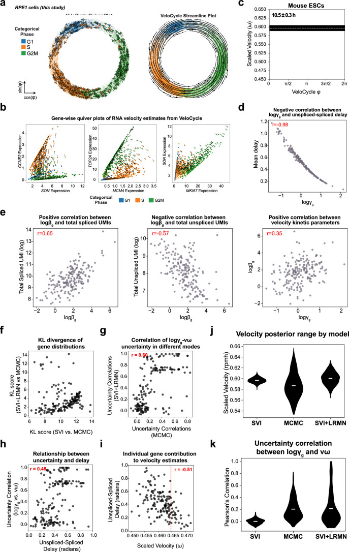
Extended Data Fig. 3. VeloCycle reveals relationships among kinetic parameters and a structured variational distribution yields better uncertainty estimates.
(a) Velocity quiver plot (left) and streamline plot (right) for 14,259 RPE1 cells from Fig. 4a-e, colored by categorical phase assignments. (b) Gene-wise velocity quiver plots for three marker gene pairs corresponding to distinct categorical phases in RPE1 cells: G1 marker SON and S marker CCNE2; S marker MCM4 and G2M marker TOP2A; G2M marker MKI67 and G1 marker SON. (c) Posterior estimate plot of cell cycle velocity inferred on mouse embryonic stem cells (mESC)37. White dashed lines represent the mean of 500 posterior samples; black bars indicate the full posterior interval. (d) Scatter-plot of the relationship between degradation rate (logγg) and average un/spliced delay in mESC. (e) Scatter-plots of the relationships among splicing rate (logβg), logγg, and total UMI counts (un/spliced) in mESC. (f) Scatter-plot of gene-wise Kullback–Leibler (KL) divergence comparing uncertainty distributions between SVI and MCMC (x-axis) and SVI + LRMN and MCMC (y-axis) for dermal human fibroblasts (dHF)37 from Fig. 4g-k. A lower KL divergence indicates a greater overlap between the two distributions. (g) Scatter-plot between the gene-wise logγg-νω uncertainties computed from the posterior of MCMC or SVI + LRMN for dHF. (h) Scatter-plot between un/spliced peak expression delay (radians) and logγg-νω uncertainty correlation, both obtained using the SVI + LRMN velocity model. (i) Scatter-plot between scaled velocity and un/spliced delay during a leave-one-out estimation approach. Each dot is positioned on the x-axis at the velocity estimate obtained when removing one particular gene (n = 160) from the gene set. Each dot is located on the y-axis at the position of the un/spiced delay (in radians) for that removed gene. (j) Violin plots of the scaled velocity for mESC, comparable to Fig. 4h. (k) Violin plots of the Pearson’s correlations between logγg and angular speed (νω) posteriors across all 189 genes for mESC, comparable to Fig. 4i. Pearson’s correlation coefficients (red) are indicated in the top right of plots in (d-e), and (g-i).

