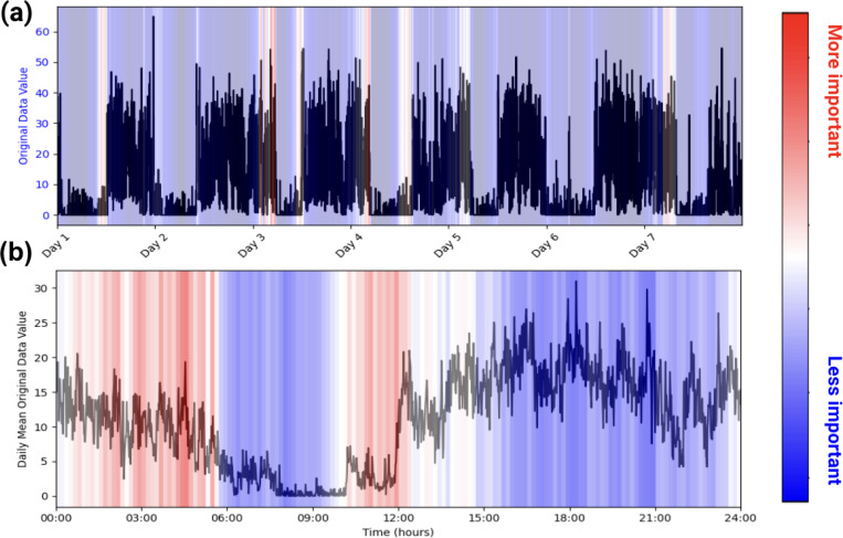
Figure 1. Example of PAT Model Explainability.
Plots (a) and (b) are of one participant labeled as taking benzodiazepines. (a) represents the participant’s actigraphy data across a week, and (b) represents that week’s actigraphy data averaged into 1 day. The levels of importance shown in the heatmap are derived from the model’s attention scores during the classification task. Attention scores, which indicate the relative focus of the model on specific time points, were normalized and mapped to a color scale, with red representing regions of higher attention (interpreted as higher importance) and blue indicating regions of lower attention. In this example, the model pays high attention to the behaviors in the early mornings and picks up on the participant’s late (noon) wake-up time when predicting benzodiazepine usage.

