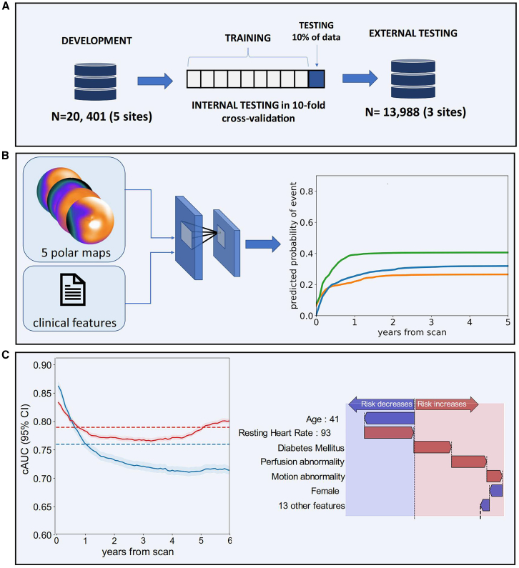
Figure 4.
Pieszko et al. trained a DL model: deep learning enabled time-to-event outcome prediction after cardiac imaging – Study overview
In this case, (C) illustrates the application of SHAP diagrams. The performance of the model (left) was analyzed using the cumulative dynamic cAUC. (A), (B), and (C) in the upper left corner of the image represent the serial numbers of the figure. Red lines represent time-to-event models, while blue lines indicate perfusion abnormalities. The interpretation of predictions is visualized as a waterfall plot, with blue arrows denoting features that reduce risk and red arrows indicating features that increase risk (right). Abbreviations used in this context include ACS, AUC, TPD, PCI (percutaneous coronary intervention), and CI (confidence interval).

