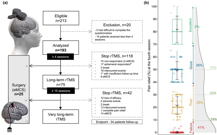
FIGURE 1.

(a) Flow chart of patients included in the analysis. Note two time points: At 4th and 15th sessions. The 4th session is a step for categorization and the 15th session is a further step for long‐term follow‐up. At the endpoint (March 2022) 34 patients were still undergoing maintenance therapy with rTMS (among them, only 1*patient had received less than 15 sessions). Among them, 2 patients received surgery after the rTMS endpoint because the follow‐up for surgery was extended until June 2023. Ephemeral responders#: Responders who discontinued rTMS session due to loss of efficacy before the 15th session. (b) Distribution of percentage of pain relief in whole population after the 4th session: Failure (0%–9%, red square), Poor result (10%–39%, yellow dot), Good result (40%–69%, blue triangle), Excellent result (≥70%, green diamond). For each group: Boxplot, mean with error bar in black and frequency of patient. On the right, density diagram of percentage of PR with the evolution of the responder rate according to the permissive ≥10% pain relief as well as more stringent thresholds (≥30% and ≥50% PR): Respectively 59%, 42%, 25%.
