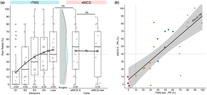
FIGURE 3.

(a) Time course of percentage of pain relief during rTMS sessions and after eMCS. Individual dots represent raw data. The black cross represents the mean of each time, with a line connecting them. In the middle, comparison of density diagram between the last rTMS session (rTMS‐last, blue) and first eMCS evaluation (eMCS‐5, pink), and no significant difference was observed. The difference in patient numbers between the two evaluation periods for eMCS efficacy is due to six patients preferring thetaburst stimulation instead of classical stimulation. (b) Association between eMCS efficacy and rTMS efficacy. Simple linear regression model (with 95% confidence interval) between the percentage of pain relief at the first evaluation after surgery (eMCS‐5) and at the last rTMS session (Spearman test: rho = 0.79, p = 2.18e−06). Various colours/shapes of dots show how patients were categorized based on their final rTMS pain relief: 10% (n = 3) Failure (0%–9%, red square), 32% (n = 8) Poor result (10%–39%, yellow dot), 24% (n = 6) Good result (40%–69%, blue triangle), 32% (n = 8) Excellent result (≥70%, green diamond). Note that 6 patients reported a better PR with rTMS, 9 patients reported no difference and 10 patients reported a better PR with eMCS.
