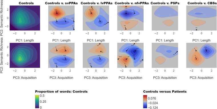
Figure 2.
Contour distributions and difference plots. The top and bottom left plots show the contour distributions across PC 1 (length), PC 2 (semantic richness) and PC 3 (acquisition age) produced by healthy controls. Difference plots comparing patients with healthy controls are shown to the right of the contour plots of healthy controls. In the control plots, yellow tones show where the greatest proportions of words were found within the PC space. For controls versus patients, the red and blue tones represent PC spaces where patients produced more words than controls and where controls produced more than patients, respectively. Taking the mean value of the proportion of words produced by each patient group (svPPA N = 9, lvPPA N = 9, nfvPPA N = 9, PSP N = 10 and CBS N = 13), we compared them to the control data (N = 24) in each of the dimensional spaces using two-tailed t-tests. The arrows indicate where in the maps there were significant differences between controls and patients (P-values are shown as asterisks indicating level of significance: *P < 0.05; **P < 0.01; ***P < 0.001). CBS, corticobasal syndrome; lvPPA, logopenic variant of primary progressive aphasia; nfvPPA, non-fluent variant of primary progressive aphasia; PSP, progressive supranuclear palsy; svPPA, semantic variant of primary progressive aphasia.

