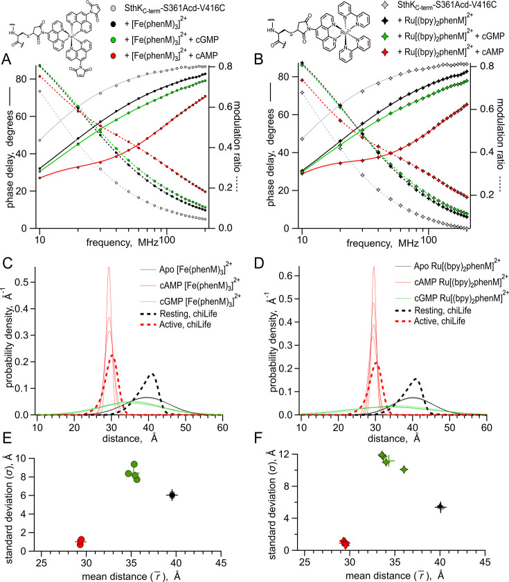
Figure 5. Lifetime measurements of SthKCterm-S361Acd-V416C with [Fe(phenM)3]2+ and [Ru(bpy)2phenM]2+.
Chemical structures of acceptors and legends for all plots shown on top. (A–B) Representative Weber plots of phase delay and modulation ratio for SthKCterm-S361Acd-V416C labeled with [Fe(phenM)3]2+ (A) and [Ru(bpy)2phenM]2+(B). Fits of the data using the single Gaussian model are shown with phase delay as solid curves and modulation ratio as dashed curves. (C–D) Spaghetti plots showing distance distributions from the model fits with apo (thin black curves, n=4), with 1.23 mM cAMP (thin red curves, n=4) and 1.23 mM cGMP (thin green curves, n=4) for [Fe(phenM)3]2+ (C) and [Ru(bpy)2phenM]2+(D). Distributions predicted by chiLife are overlayed in dashed curves. (E–F) Summary of Gaussian fit standard deviations, , versus average distances, , for [Fe(phenM)3]2+ (E) and [Ru(bpy)2phenM]2+ (F), with average values as cross marks.


