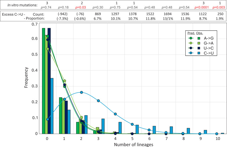
Fig 6.
Distribution of mutations. The distribution of unfixed transitions (<5% frequency) between lineages (histogram) compared to expected values assuming no positional bias derived from the Poisson distribution (graph points). Excess numbers over the mean numbers of A→G, G→A, and U→C transitions (total excess 8,651 from 12,907 C→U transitions) and their proportions of total C→U substitutions in each category are shown in the upper box. The distribution of C→U transitions at sites of previously reported in vitro A3A-induced mutations (27) is shown in the lower box (Fig. S1); differences in lineage distributions with observed values calculated by Pearson chi-squared.

