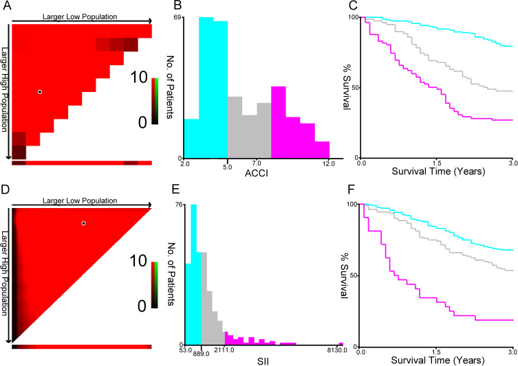
Figure 1.
The optimal ACCI (A-C) and SII (D-E) cutoffs of 353 NSCLC patients using X-tile bioinformatics software. (A and D) The data were represented graphically in a right-triangular grid where each point represented the data from a given set of divisions. The plots showed the χ2 log-rank values produced, dividing them into three or two groups by the cut-off point. The optimal cut-points (5.0 and 889.0) were determined by locating the brightest pixel on the X-tile plot. The distribution of the number of patients was shown on the histogram (B and E), and corresponding populations were displayed on the Kaplan–Meier curve (C and F), respectively.

