Figure 4.
TAD boundary differences between MB subgroups
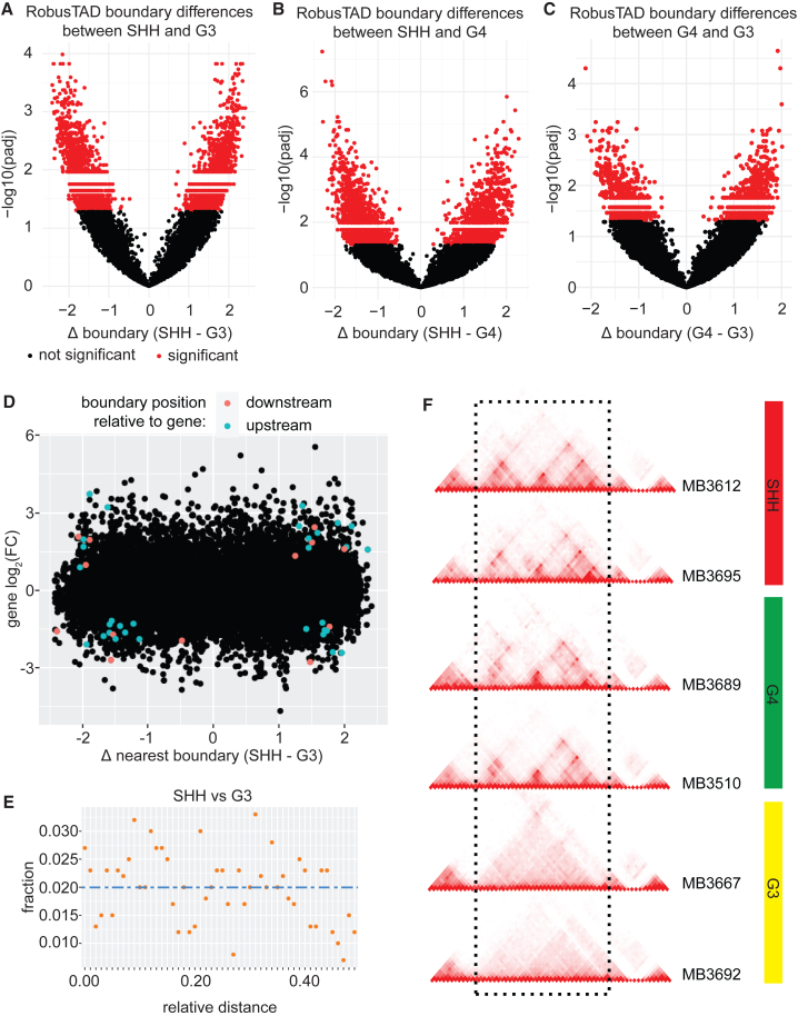
(A) Volcano plot displaying differential TAD boundaries between SHH and G3 MBs. Negative log10 of the adjusted p value (padj) are displayed along the y axis.
(B) Volcano plot displaying differential TAD boundaries between SHH and G4 medulloblastomas.
(C) Volcano plot displaying differential TAD boundaries between G4 and G3 medulloblastomas.
(D) Relationship between gene expression and differences in boundary strengths between SHH and G3 MB. Each dot represents a gene. Colored dots represent differentially expressed genes between SHH and G3. Pink dots represent genes that are differentially expressed and have a differential boundary downstream. Blue dots represent genes that are differentially expressed and have a differential boundary upstream.
(E) Relationship between differentially expressed genes and their distance from differential TAD boundaries between SHH and G3 samples. Blue dashed line represents the expected frequency of observations based on 50 kb bins. Orange points represent the observed frequencies.
(F) Example of differential boundaries between G3 and other MB subgroups. Two SHH samples, two G4 samples, and two G3 samples are displayed. The dashed rectangle highlights a genomic region with locally different topology in G3 tumors compared to SHH and G4. Specifically, the TAD structures observed in SHH and G4 MB are lost in G3 samples.

