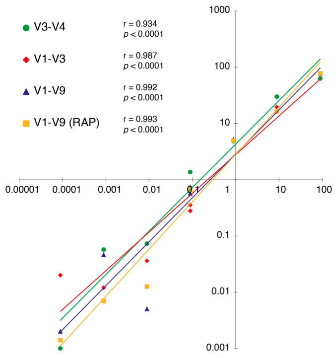
Figure 2.
Correlation plots between the expected standard distribution of the mock community (X axis) and the relative abundances detected in our sequencing output (Y axis). A logarithmic scale was used to represent the data and a Pearson correlation coefficient (r) was calculated for each one of the library–primer combinations used in the study.

