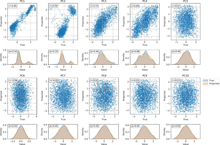
Extended Data Fig. 3. Comparison of the top 10 actual and 1000GP projected PCs.
For each PC, we show a scatter plot and kernel density estimate (KDE) plot. In the scatter plots, the actual PC values are plotted on the x-axis and the projected PC values are plotted on the y-axis. The Pearson correlation coefficient is shown in the top left corner of each scatter plot. In the KDE plots, the true PC distribution is shown in blue and the projected PC distribution is shown in orange. The p-value of a two-sided Kolmogorov-Smirnov test comparing the two distributions is shown in the top left corner of each KDE plot. No multiple hypothesis correction was needed.

