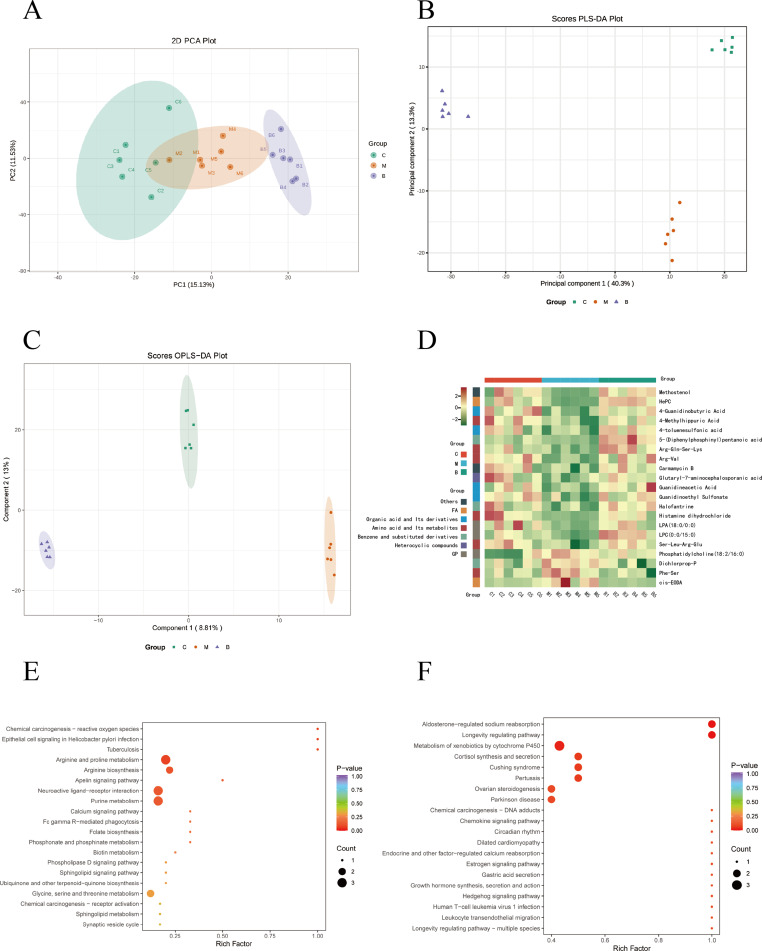
Figure 5.
Metabolomics analysis of serum in rats. (A) PCA plot chart. PC1 represents the first principal component, PC2 represents the second principal component, and percentage represents the interpretation rate of this principal component to the data set. Each point in the diagram represents a sample, and samples from the same group are represented using the same color. (B) Partial Least Squares Discriminant Analysis (PLS-DA) plot of all groups. Data from different groups were considered significant when p < 0.05, as labeled by different lowercase letters. (C) OPLS-DA score chart. The horizontal coordinate indicates the predicted component score value, and the horizontal coordinate direction shows the gap between groups; the vertical coordinate indicates the orthogonal component score value, and the vertical coordinate direction shows the gap within groups; the percentage indicates the degree of explanation of the component to the dataset. (D), Hierarchical clustering analysis heatmap of 21 differential metabolites. (C) Control group, (M) Model group, (B) BBR group. (E and F) KEGG functional enrichment analysis of differential metabolites. Rich factor indicates the ratio of the number of differentially expressed metabolites in the corresponding pathway to the total number of metabolites annotated in the pathway. p value is closer to 0, indicating a more significant enrichment. The size of the dots in the graph represents the number of differentially significant metabolites enriched to the corresponding pathway.

