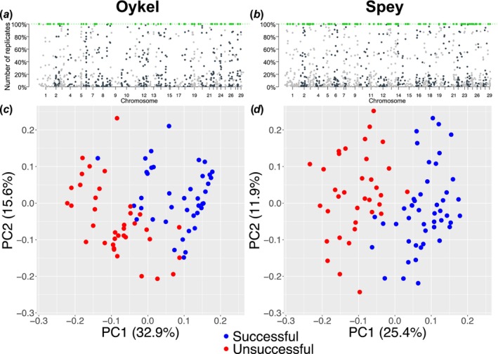
FIGURE 3.

The Manhattan‐style plots (a, b) show all outlier SNPs (dots) identified in bootstrap replicated datasets using ‘OutFLANK’ in each river. The outliers consistently detected in 100% of replicates and used for analysis are highlighted in green. The y‐axis shows the proportion of replicated datasets where each individual outlier SNP was identified. The x‐axis displays the position of the SNPs along the genome with chromosome numbers. (c and d) Principal components analysis scatterplots based on 70 (Oykel) and 67 (Spey) outlier SNPs between successful (blue) and unsuccessful (red) migrant Atlantic salmon smolts. Each dot represents an individual fish. Variance (%) explained by the first and second axes is also shown.
