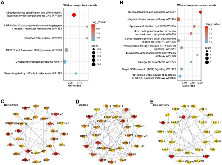
Fig 2. Enrichment analysis and PPI network analysis for key modules.
(A-B) Bubble plots, Wikipathway enrichment analysis of genes in (A) the black module and (B) the turquoise module, the size of each bubble represents the gene count and the color represents the adjusted p-value. (C-E) Visualization of the PPI network of the top 30 genes identified by the BottleNeck (C), Degree (D), and EcCentricity (E) algorithms. In each network, nodes represent genes, edges represent protein-protein interactions, and the node size reflects the connection degree within the network.

