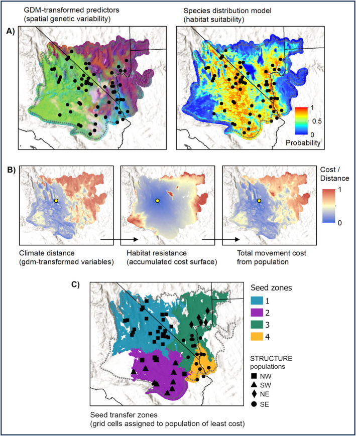
FIGURE 4.

Flowchart of seed transfer zone delineation analysis. (A) Inputs include GDM‐transformed environmental predictors, reflecting gene–environment associations, here displayed as an RGB composite where similar colors indicate similar genetic composition; and a species distribution model (SDM) with probabilities of occurrence. (B) Seed zones are based on accumulated movement cost from population centers (here, represented by the yellow point in the panels), including genetic distance (multivariate Euclidean distance on GDM‐transformed environmental predictors) and habitat resistance (least cost paths from SDM). The two layers are combined to reflect total movement cost. (C) A nearest‐neighbor search is used to assign grid cells to the population of least total movement cost, resulting in seed transfer zones.
