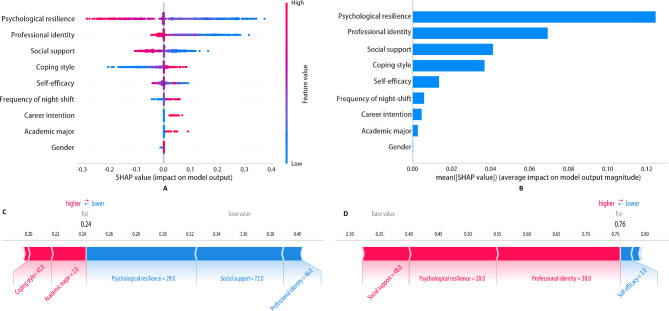
Fig. 6.
Interpretation of the results of XGBoost classification model based on the SHAP method. SHAP summary chart (A) and bar chart (B). The left dot plot represents the direction of contribution of each value of each variable, with red indicating larger values and blue indicating lower values of each variable. The right bar plot represents the importance of the variables and their overall contribution to the model predictions. C-F indicates that the SHAP scores explain the predicted risk of compassion fatigue in two subjects

