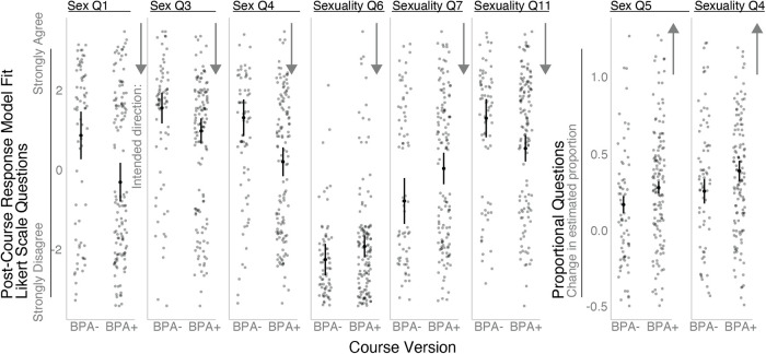
FIGURE 1.
Change in survey responses by course type. Box and whisker plots of median, interquartile range, and total range excluding outliers for all questions in which BPA treatment was significant in the model. Plots depict the predicted student's postcourse response based on the linear models to visualize changes in student response scores. Solid black dots indicate predicted means and the lines indicate 95% confidence intervals. Gray dots indicate predicted data points based on the raw data. For the top plot of Likert scale questions (Strongly Agree to Strongly Disagree), a negative number indicates a shift towards “Disagree,” and a positive number indicates a shift in attitude towards “Agree” after having taken the course. Arrows on the y-axis indicate the intended direction of the intervention, indicating that students shifting in that direction would hold a less cisheteronormative view. For the two plots on the right of proportional questions (0 to 100%), a negative number indicates a shift towards “0%,” and a positive number indicates a shift in attitude towards “100%” after having taken the course. Proportional plots extend into negative numbers even though the actual survey question ranged from 0 to 100% because these numbers are model fits, not true values. Gray points indicate individual survey responses from the raw data, after incorporating effects of other identities in the model.

