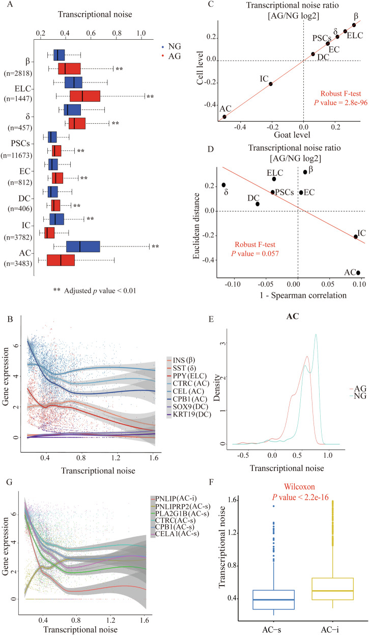
Fig. 5. Most cell types show increased transcriptional noise during the growth stage.
A Boxplot illustrates transcriptional noise by age and cell type for the indicated number of cells. For all boxplots, the box represents the interquartile range, the horizontal line in the box is the median, and the whiskers represent 1.5 times the interquartile range. Blue and red colors indicate neonatal and adult cells, respectively. Asterisk indicates significant changes (Wilcoxon’s rank sum test, adjusted p value < 0.01). Cell types are ordered by decreasing transcriptional noise ratio between neonatal and adult cells. B Expression of cell-typical markers in pancreatic endocrine and exocrine cells, ranked by transcriptional noise. Dots represent individual cells, line is running mean, with k = n / 5. C Scatterplot shows the log2 ratio of transcriptional noise between AG and NG samples as calculated using goat averages and single cells on the X and Y axes, respectively. D Scatterplot depicts the log2 ratio of transcriptional noise between AG and NG samples as calculated using 1–Spearman correlation and the Euclidean distance between cells on the X and Y axes, respectively. For both panels, the size of the dots corresponds to the negative log10 adjusted p value of the cell type-resolved differential transcriptional noise test and the red lines correspond to the robust linear model regression fit. E As an example, the distribution of 1–Spearman correlation coefficients between all pairs of neonatal and adult cells is shown for AC cells. Larger values represent increased transcriptional noise. Blue and red colors indicate NG and AG samples. F Boxplot illustrates transcriptional noise by acinar cell subtypes. G Expression of the selected markers in AC, ranked by transcriptional noise. Dots represent individual cells, line is running mean, with k = n / 5.

