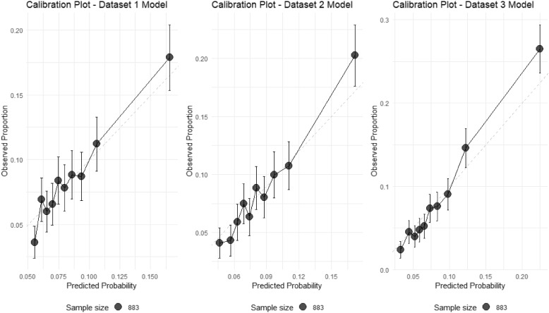
Fig. 3.
Calibration plots for preterm birth prediction models across three datasets. The plots show the relationship between predicted probabilities and observed proportions of preterm birth for models based on (A) Dataset 1, (B) Dataset 2, and (C) Dataset 3. The dashed diagonal line represents perfect calibration, a hypothetical scenario where the predicted probabilities of preterm birth exactly match the observed proportions. Points represent deciles of predicted risk, with vertical bars indicating 95% confidence intervals. Point size is proportional to the number of patients in each group. While all models maintain accurate overall prediction of preterm birth rate (8.6%), they tend to compress predictions toward the population mean, particularly for high-risk cases. Dataset 3 model shows the widest range of predictions (1.1% to 85.1%), suggesting improved risk stratification at later visits

