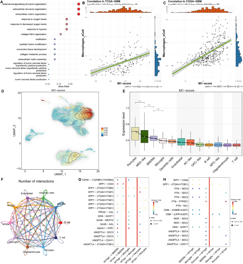
Fig. 4.
The interplay between the M1 module-specific expressed cells and the tumor microenvironment. A The results of the GO enrichment analysis for the 38 core genes of Module 1. B-C The relationship between the M1-score and Macrophages_xCell. The green line is the fit from a linear regression model, indicating the trend between M1-score and Macrophages_xCell. D The density plot of the M1 gene set enrichment score distribution on UMAP. E Box plot demonstrate the M1 gene set enrichment score of each cell type. F The network of interactions between tumor cells exhibiting high M1 levels and those with low M1 levels in relation to other cellular entities. Node size indicates the frequency of interactions, whereas the thickness of the edges denotes the quantity of significant ligand-receptor interactions observed between the two cellular phenotypes. G-H The bubble heatmap illustrates the strength of interactions between cells for various ligand-receptor pairs, with the size of each dot reflecting the p-value obtained from the permutation test, and the color of the dot indicating the probability of communication. Areas lacking dots denote a communication probability of zero

