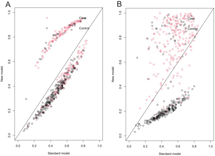
Figure 5. NRI scatter plots comparing the standard KBRC-5 model with the modified IKBRC and SKBRC models.
(A) NRI scatterplot comparing the standard KBRC-5 model with the improved IKBRC model. (B) NRI scatterplot comparing the standard KBRC-5 model with the improved SKBRC model. The two scatter plots illustrate the reclassification of cases and controls using the improved model vs the standard KBRC-5 model, respectively. The x-axis represents the predicted probabilities of post-biopsy bleeding complications from the standard model, while the y-axis represents those from the improved model. Each point corresponds to an individual patient, with red points indicating cases (patients with bleeding complications) and black points representing controls (patients without bleeding complications). The diagonal line indicates no change in predicted probabilities between the two models. Points above the diagonal represent individuals for whom the improved model assigned a higher predicted probability compared to the standard model, while points below the diagonal represent individuals with a lower probability.

