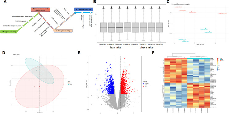
Figure 1.
Comparison of DEGs present in obese and lean samples. (A) A flowchart showing the steps in this study. Box plots of the gene expression data after normalization. (B) The horizontal axis represents the sample symbol, which is divided into a lean and obese group, with four samples in each group, and the vertical axis represents the gene expression values. The black line in the box plot represents the median value of gene expression. (C, D) Principal component analysis (PCA) plots showing the expression variability of DEGs across all the samples. The red colour represent lean sample, the green colour represent obese sample. (E) The volcano plot for DEGs in the GSE100012 dataset. The X-axes index the -log (P value), and the y-axes index the log fold change. The red dots represent upregulated genes, and the blue dots represent downregulated genes. The gray dots represent genes with no significant difference. FC is the fold change. (F) The expression data are represented as a data matrix wherein each row represents a gene and each column represents a sample. The green coded bar above the heatmap represents the lean sample set, and the red coded bar represents the obese sample. The expression level is described in terms of the color ratio of the upper left corner. Hierarchical clustering is shown by the top tree view, indicating the degree of relatedness in gene expression. DEG, differentially expressed genes; FC, fold change.

