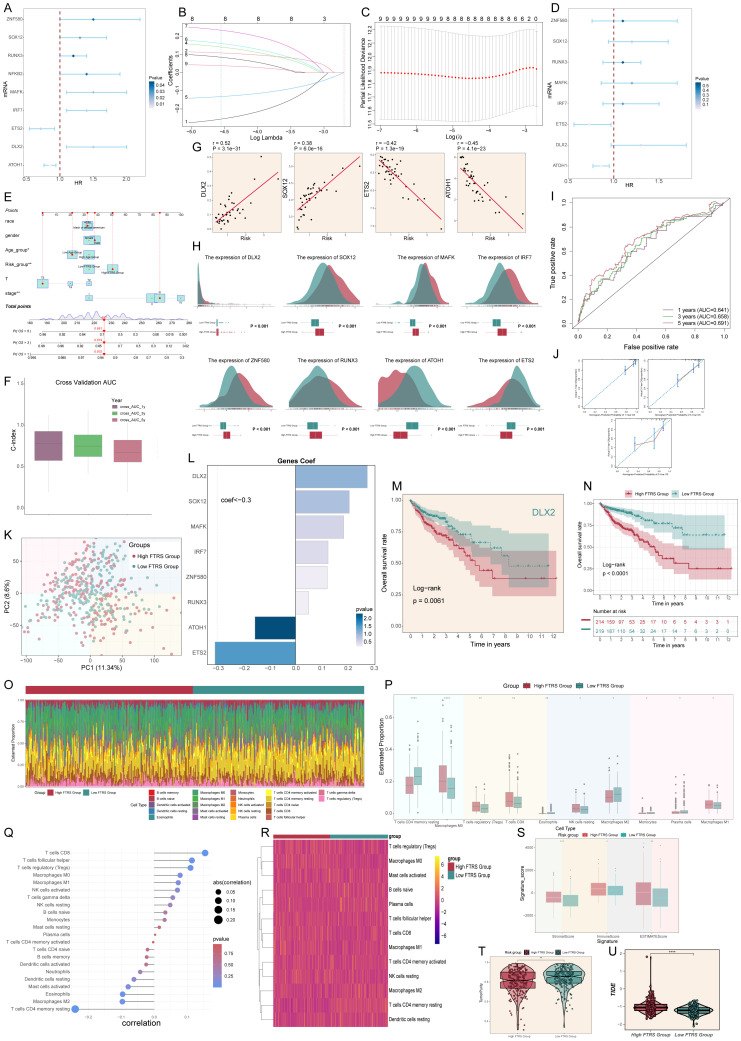
Figure 8.
Constructed risk score profiles and immune infiltration and survival prognostic analyses for CRC. (A) Forest plot from univariate Cox regression analysis showcased statistically significant genes (P<0.05) with HR<1 indicating protective factors and HR>1 indicating risk factors. (B, C) Selection of eight prognostic-related genes (non-zero regression coefficients) was made via LASSO regression analysis, LASSO coefficient curve determined by optimal lambda (B), with optimal parameter (lambda) determined through cross-validation (C). (D) Forest plot of eight prognosis-related genes. (E) Column line graphs were used to predict patients’ prognosis at 1 year, 3 years and 5 years. For categorical variables, the importance of each variable was ranked according to the standard deviation of the column-line graph scale. To use a column line plot, individual patient-specific points are located on each variable axis. Red lines and dots are plotted upward to identify the point at which each variable is received; the sum of these points (280) is located on the Total Points axis, and a line is plotted downward to the Survival axis to identify the probability of overall survival. (F) Box line plots depict the C-index of the AUC values of the risk scores for predicting 1-, 3-, and 5-year survival. (G) Four genes that showed a significant correlation with the risk scores (DLX2, SOX12, ETS2 and ATOH1). (H) The ridge and box line plots showed that gene expression of these four genes (DLX2, SOX12, MAFK, IRF7) was higher in the high-risk group compared to the low-risk group, while gene expression of these four genes (ZNF580, RUNX3, ATOH1, ETS2) was lower in the high-risk group. (I) ROC curves depict the sensitivity and specificity of the risk scores for predicting 1-, 3-, and 5-year survival. (J) Calibration curves for column charts predicting 1-, 3-, and 5-year overall survival. The OS predicted by the line plot model is plotted on the x-axis and the actual OS is plotted on the y-axis. (K) The PCA plot demonstrated the difference in the distribution of prognosis-related genes in the high FTRS and low FTRS groups. (L) Bar chart showed the coefficient (Coef) values of genes utilized for model construction. (M) OS curve of DLX2, a highly expressed gene screened by LASSO. (N) OS curves for different scoring subgroups in a cohort (high FTRS group and low FTRS group). (O) Proportion of each infiltrating immune cell type in the high- and low-FTRS groups were shown using CIBERSOFT. (P) Statistically different infiltrating immune cell type in the high- and low-FTRS groups were demonstrated using CIBERSOFT. * stands for P ≤ 0.05, ** stands for P ≤ 0.01 and **** represents P ≤ 0.0001. (Q) Lollipop chart of immune cell versus risk score. (R) Heatmap demonstrated the difference in expression of different immune cells in the two risk groups. (S) Stromal score, immune score, and estimate score were calculated for the high- and low-FTRS groups, respectively, using ESTIMATE. * stands for P ≤ 0.05, ** stands for P ≤ 0.01 and *** represents P ≤ 0.001. (T) TumorPurity was calculated using ESTIMATE for the high- and low-FTRS groups, respectively. ** stands for P ≤ 0.01. (U) Violin plot demonstrating the difference in Tumor Immune Dysfunction and Exclusion (TIDE) scores in the two risk groups. **** represents P ≤ 0.0001, a statistically significant difference.

