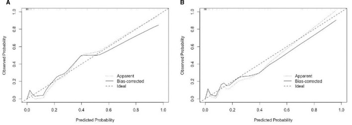
Figure 5.
(A) The nomogram for sarcopenia in the training set was calibrated using a curve. (B) The nomogram for sarcopenia in the validation set was calibrated using a curve. The X-axis depicts the anticipated likelihood, while the Y-axis signifies the factual ratio. The ideal model's best prediction is denoted by the diagonal dotted line. The nomogram's uncorrected performance is depicted by the apparent line, whereas the bias-corrected performance is depicted by the solid line.

