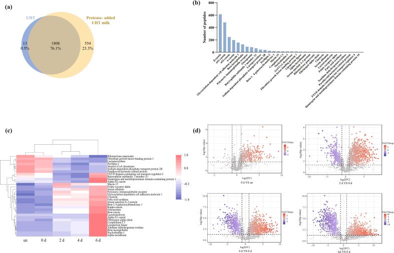
Fig. 2.
(a) Venny diagram of peptides identified in UHT milk and protease-added UHT milk. The overlapped part in the figure is the peptide shared by the two groups of samples. (b) The rank of peptides produced by 32 different types of proteins linked to the peptides that were identified. (c) Heatmap analysis of proteins linked to the identified peptides. “un”: UHT milk without addition of enzyme; “0 d, 2 d, 4 d, 6 d”: UHT milk with enzyme stored for 0 days, 2 days, 4 days, and 6 days. The change of the grid from red to blue means that the peptide content goes from high to low. (d) ∼ (g) Volcano plot of identified peptides in periods. The increase in peptide content is indicated by red circular markers. The reduction in peptide content is indicated by a blue circular mark. (For interpretation of the references to color in this figure legend, the reader is referred to the web version of this article.)

