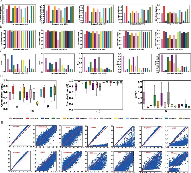
Figure 3.
Evaluation of imputation methods for data recovery. (A) Bar plots illustrating the mean correlation between the imputed and complete datasets for each gene, calculated using Pearson correlation coefficient (PCC). (B) Bar plots depicting the mean correlation between the imputed and complete datasets for each cell, calculated using PCC. (C) Bar plots representing the imputation error between the imputed and complete datasets. (D) Box plots showing the distribution of gene-level correlation, cell-level correlation, and imputation error for different imputation methods across various dropout datasets. (E) Scatter plots demonstrating the relationship between true and predicted values (log-transformed) for each gene and cell. The red baseline represents perfect alignment between the true and predicted values.

