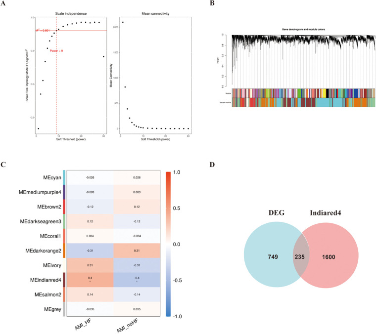
Figure 2.
WGCNA analysis of the GSE11947 gene expression matrix. (A) Scale-free network model. (B) Dendrogram constructed based on the correlation of gene expressions. (C) Heatmap of the correlation between modules and prognostic traits (Deeper colors indicate higher correlation, with red representing a positive correlation and blue representing a negative correlation). (D) Venn diagram of genes in the “Indianred” module and differentially expressed genes.

