Figure 5.
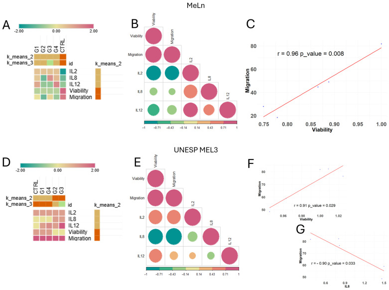
Heatmap, clustering, and correlation analysis of groups for each cell line. (A) MeLn cell line k-means clustering indicates that treated groups are more closely correlated than the control group (Z-score scale). (B) Correlation matrix. A graphical representation of correlation values among analyzed parameters, where the color scale indicates the R-value. Circle size represents correlation strength, with red tones indicating positive correlations and green tones indicating negative correlations. A significant correlation was observed only between cell viability and migration capacity. (C) Scatter plot. Displays a strong positive correlation between cellular migration and viability (r = 0.96; p = 0.008). (D) UNESP MEL3 cell line k-means clustering shows G2 and G3 as closely related, while CTRL, G1, and G4 display greater correlation among themselves. (E) Correlation matrix. Graphical representation of the correlation among analyzed parameters, with significant correlations observed between viability and migration capacity, as well as IL-8 expression and migration capacity. (F) Scatter plot. It shows a strong positive correlation between cellular migration and viability (r = 0.91; p = 0.029). (G) Scatter plot. Displays a strong negative correlation between cellular migration and IL-8 expression (r = −0.9; p = 0.033).

