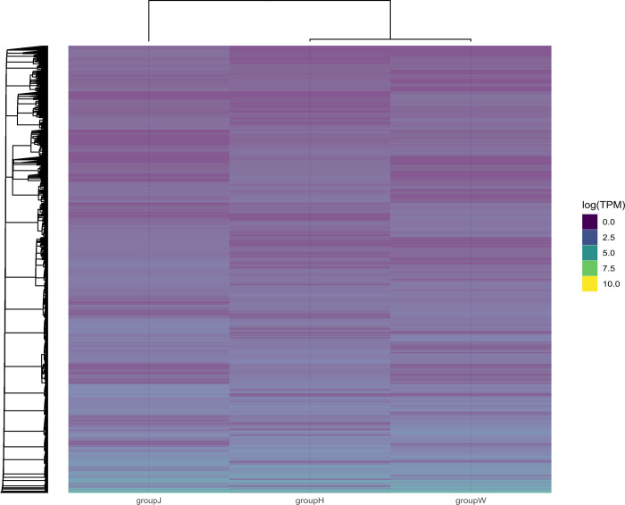
Fig 4. Heatmap of differentially expressed gene clustering.
The colors can only be compared horizontally with the same clustering of genes for expression values (TPM) in the high (blue) and low (yellow) colors. Axes: Bottom, variable groups; top, hierarchical clusters for closeness between groups; left, hierarchical clustering among the expressed genes.

