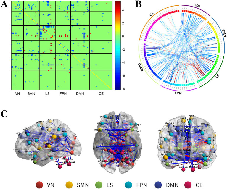
Figure 2.
The changes metabolic correlation network between the NSF group and HC group. (A–C) represent the connectivity matrix maps, Circos and connectivity graph of the metabolic connectivity comparison between the NSF group and HC group. Compared to the HC group, the NSF group shows that abnormal metabolic connections were found in the DMN, FPN, VN, SMN, LS, and CE. The blue nodes represent reduced metabolic connectivity, and the red nodes indicate increased metabolic connectivity (A). The red line indicates increased connectivity and the blue line indicates decreased connectivity, and the line width represents the differences in significant T values (p < 0.017, FDR corrected) (B,C). DMN, default mode network; LS, limbic system; FPN, frontoparietal network; VN, visual network; SMN, sensorimotor network.

