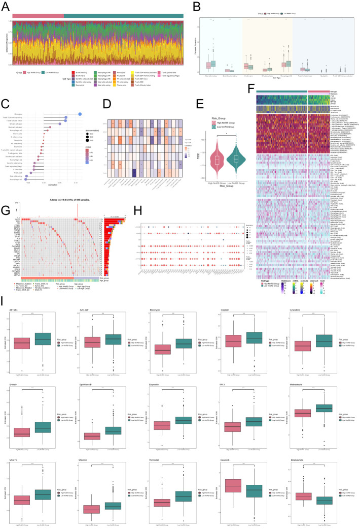
Figure 10.
Analysis of immune infiltration differences and drug sensitivity in different risk groups of C3 NEFH+ malignant cells. (A) Stacked bar graph displayed the distribution of twenty-two immune cells among different risk score groups. (B) Box plot showed the differences in eight types of immune cells between high and low NmRS groups. (C, D) Lollipop chart and heatmap displayed the correlation analysis between immune cells and risk scores, model genes, and OS. (E) Differences in TIDE levels were shown between high and low NmRS groups. (F) Heatmap displayed the differences in infiltration levels of immune cells calculated using CIBERSORT and Xcell, as well as the model genes, StromalScore, ImmuneScore, ESTIMATScore, and Tumor Purity between the high and low NmRS groups. Color scale was based on standardized data. (G) Calculation of the correlation between DEGs and tumor mutation burden, and waterfall plot showed the results in the high and low-risk score groups. (H) Bubble plot showed the correlation between model genes, risk scores, OS, and immune checkpoint-related genes. (I) Drug sensitivity analysis. *P < 0.05, **P < 0.01, ***P < 0.001.

