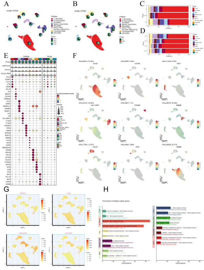
Figure 2.
Single-cell analysis in PCa. (A, B) The UMAP plots depicted the single-cell lineage revealed in this work and labeled cell types using established marker genes (T-NK cells, B-plasma cells, ECs, myeloid-cells, MCs, EPCs, pericytes-SMCs, fibroblasts, and pDCs). The pie charts depicted the allocation of individual cell types across various Group and Phase classifications. (C, D) The stacked bar graphs illustrated the relative amounts and distributions of nine cell types in various tissue sources and stages of the cell cycle. (E) The bubble plot depicted the levels of gene expression for the five most significantly different genes across the nine cell types of PCa. The size of each bubble was proportional to the percentage of gene expression, while the color indicated data normalization. (F) The UMAP plots were used to show the differential gene expression in the nine cell types. (G) The UMAP plots displayed the G2/M scores, S scores, nFeature-RNA, and nCount-RNA of the nine cell types. (H) Conducting enrichment analysis to identify variations in biological processes across distinct cell types in PCa.

