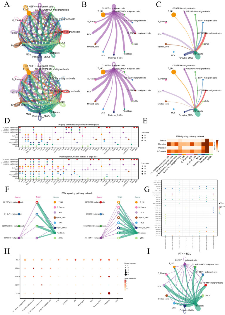
Figure 5.
Cellular communication landscape in PCa. (A) Circle graphs displayed the number (upper) and intensity (lower) of interactions among all cells in PCa. The size of each circle was proportional to the number of cells in each group, and the edge width represented the communication probability. (B) Circle graphs displayed the number (upper) and intensity (lower) of interactions of C3 NEFH+ malignant cells as the source with other cells. (C) Circle graphs displayed the number (upper) and intensity (lower) of interactions of fibroblasts as the target with other cells. (D) Bubble plots compared the outgoing communication patterns of secretory cells (upper) and the incoming communication patterns of target cells (lower). The size of each dot was proportional to the contribution score calculated by pattern recognition analysis. Higher contribution scores indicated richer signaling pathways in the corresponding cell group. (E) Heatmap displayed the centrality scores of the PTN signaling pathway. (F) Hierarchical graph depicted the interactions between C3 NEFH+ malignant cells and other cell types in the PTN signaling pathway. (G) Comparative Analysis of Significant Ligand-Receptor Pairs in the Interaction of C3 NEFH+ Malignant Cells with Other Non-malignant Cell Types. The color of the dots represents the probability of communication between specific ligand-receptor pairs across the sender cell clusters and the recipient cell clusters. The ligand is denoted as the former and the receptor as the latter, separated by a hyphen. (H) Bubble plot displayed the interactions between cells in the PTN signaling pathway. (I) Circle plot showed the communication network of PTN-NCL ligand-receptor pairs with tumor cells as the receiver.

