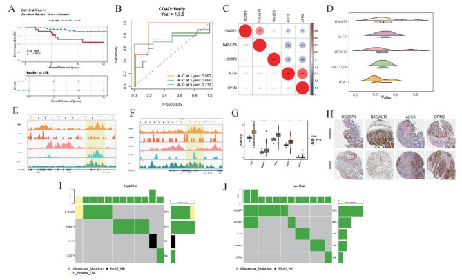
Fig. 3.
Detailed analysis of risk stratification and function exploration of prognostic genes in GSE12945 dataset. (A) Kaplan-Meier (KM) Survival Analysis. The KM plot depicts survival trajectories distinguishing high-risk from low-risk patients in the GSE12945 dataset. The blue trajectory signifies prolonged survival times in the low-risk population, markedly diverging from the red line, indicative of shorter survival periods in high-risk individuals. (B) Time-Dependent Receiver Operating Characteristic (ROC) Curves-Training Data (GSE12945). Shows the temporal accuracy of the model in forecasting 1-, 3-, 5-year Overall Survival (OS) outcomes using training set data. (C) Correlation Heatmap of Five Prognostic Genes (GRGs). Demonstrates correlations among five selected GRGs. Red dot represent positive correlations, signified by asterisks for statistically significant relationships, with blue hues denoting negative correlations. (D) Functional Similarity of Five GRGs. Elucidates the extent of shared functionalities among the GRGs, highlighting their collaborative involvement in similar biological pathways or processes, contributing to disease etiology or patient prognosis. (E,F): Chromatin Landscape of Two Genes (ALG3 and DPM2) Around Transcription Start Sites (TSS). Reveals the epigenetic modifications surrounding the TSS of ALG3 and DPM2, potentially influencing gene expression regulation. (G) Expression Profiles of Five GRGs in Tumor vs. Normal Samples. Compares the expression levels of the five GRGs in tumor tissues versus healthy controls, indicating their altered states in carcinogenesis. (H) Immunohistochemical Staining of Gene Expression. Provides direct evidence of protein expression in tissue sections, correlating mRNA abundance with immunohistochemical signals, thereby bridging genomic findings with phenotypic manifestations. (I,J): Mutation Profiling in High and Low-Risk Groups. Bar charts summarize mutation occurrences per gene in respective risk categories, emphasizing mutational landscapes distinctive to each group. Color codes identify types of mutations, with the accompanying bar chart depicting relative frequencies, illuminating genetic mutation contributing to risk stratification.

