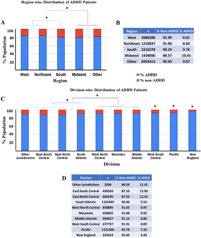
Figure 5.
The figure provides a detailed analysis of ADHD prevalence across different U.S. regions and divisions. The bar charts and accompanying tables depict the percentage of ADHD (in red) and non-ADHD (in blue) individuals within each geographic category. *Indicates a statistically significant difference between groups (ANOVA followed by pairwise comparison Bonferroni test, p < 0.0001). (a) The stacked bar chart visually displays the percentage of ADHD prevalence within each regional category (West, Northeast, South, Midwest and Other). (b) The table next to the chart details the number of individuals (n) within each regional group and the corresponding percentages of non-ADHD and ADHD patients. (c) The stacked bar chart represents the % ADHD and non-ADHD reported populations with respect to various divisions in the United States from data collected in 2022. (d) The table represents the ADHD and non-ADHD % populations and the total number (n) of subjects in each category.

