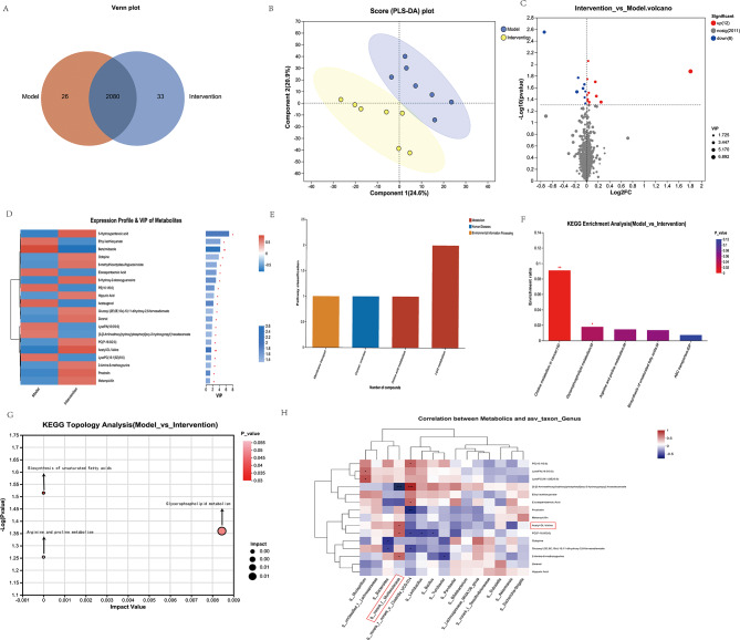
Fig. 5.
A comprehensive comparative metabolic analysis was performed to compare the liver metabolite profiles between the Con A + PBS and Con A + MSC-EV groups. (A) Composition of liver metabolites between the Con A + PBS and Con A + MSC-EV groups of mice is represented by a Venn diagram of metabolites. (B) PLS-DA score plot of liver metabolites between the Con A + PBS and Con A + MSC-EV groups of mice. (C) A volcano plot was generated to illustrate the distribution of all the metabolites identified via LC‒MS between the Con A + PBS and Con A + MSC-EV groups. (D) Heatmap of distinct metabolites between the Con A + PBS and Con A + MSC-EV groups. Differentiated groups are illustrated by the horizontal axis, metabolites by the vertical axis, and quantities of metabolites by colored blocks at different locations. A significant change was considered as VIP > 1 and p > 0.05 for the metabolites. (E) KEGG pathway classification: detected and annotated metabolites. The x-axis displays level-2 terms of the KEGG pathway, whereas the y-axis shows the number of identified metabolites. (F) Differentially abundant metabolites in the Con A + PBS group versus the Con A + MSC-EV group were analyzed for enriched metabolic pathways. On the X-axis, the significantly enriched pathways for the participating metabolites are represented. The y-axis represents the enrichment ratio, which represents the ratio between metabolites enriched in the pathway and all metabolites identified in the pathway. The colors represent the significance of enrichment; the deeper the color is, the more significant the enrichment. (G) Topological analysis of metabolic pathways between the Con A + PBS and Con A + MSC-EV groups. The x-axis denotes the relative significance of metabolites within the pathway and their corresponding impact values. The y-axis represents the enrichment significance of metabolites in the pathway, quantified as − log10 (P value). The bubble size indicates the impact value, whereas the bubble color signifies the P value. Larger bubbles indicate greater importance of the pathway. (H) Alterations in liver metabolite and fecal genus abundances. A heatmap shows the Pearson correlation coefficients between changes in fecal metabolite concentrations and variation in the relative abundances of the top 15 enriched bacterial genera. Each cell color intensity indicates the strength of the correlation between changes in liver metabolites and shifts in genus abundance. Statistical significance was adjusted for multiple comparisons via Benjamini‒Hochberg false discovery rate correction. *P < 0.05, **P < 0.01, and ***P < 0.001

