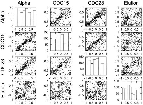
Figure 3.
Correlation of peak timing between different experiments. For each set of genes in an experiment the 1000 genes with the highest cyclicities were identified. The phase locations of these genes were then compared in a scatter plot against the phase location in the other three experiments. The phase location was determined for each gene using the fitted Fourier pattern. The graphs on the diagonal are histograms summarizing the frequency of the 1000 genes with the highest cyclicities having peaks of expression at particular times during the cell cycle.

