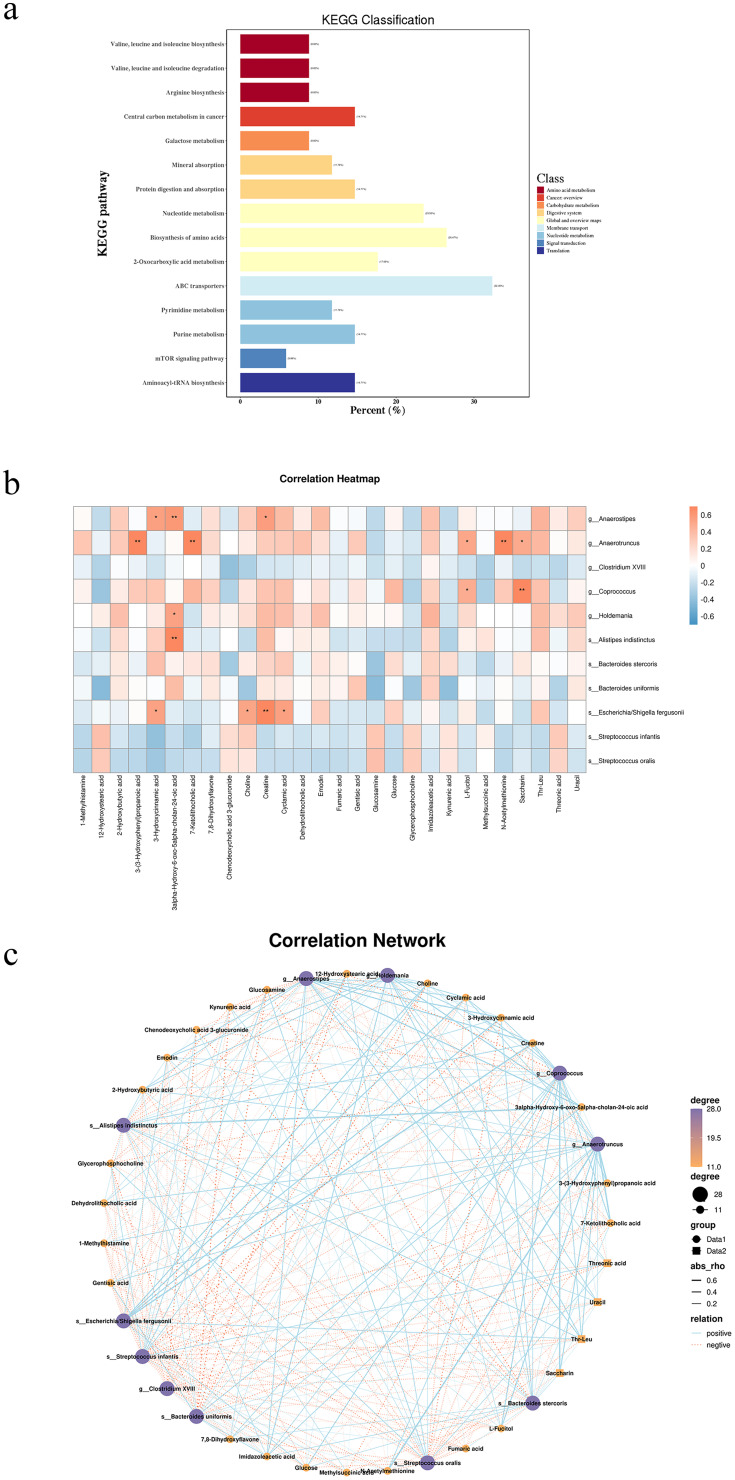
Figure 4.
(a) Annotated map of KEGG pathways for differentially abundant metabolites; (b) Heatmap of fecal microbes associated with metabolites. Rows represent differentially abundant microbes, with the right-hand legend providing correlation coefficients, where Orange denotes a positive correlation and blue denotes a negative correlation (*: P < 0.05, **: P < 0.01). (c) Network map of fecal microbes associated with metabolites. Rows represent differentially abundant microorganisms, with the right-hand legend providing correlation coefficients: blue solid line for positive correlation and orange dashed line for negative correlation.

