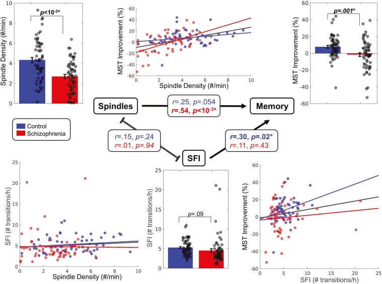
Figure 2.
Relations between sleep spindle density, SFI, and SDMC of the MST. Bar graphs depicting group differences in spindle density (top left), SFI (bottom middle), and MST improvement (top right) for each group (mean ± SE). Scatter plots show the relations of spindle density with SFI (bottom left), spindle density with MST improvement (top middle), and SFI with MST improvement (bottom right). Regression lines are shown for each group and for the groups together. The central triangle depicts relations between variables. Arrows represent significant relationships.

