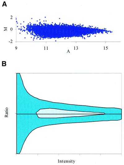
Figure 7.
A Dudoit graph of typical microarray signals. (A) M represents the fold increase or decrease and A represents the reference signal intensity (control channel). These slides have been hybridized with identical probe. Notice how all of the signals fall within a 2-fold increase or decrease. For signals at higher intensities, the error envelope tends to taper off. (B) A diagrammatic representation of the Dudoit graph shown in (A). This ratio profile is a rotation of the graph shown in Figure 3B(2) about the origin. Notice how the ratio at the lower signal intensities is larger than that of the higher signal intensities. The hatched area indicates where the majority (70%) of the data points lie. The solid area indicates where the remaining data points reside.

