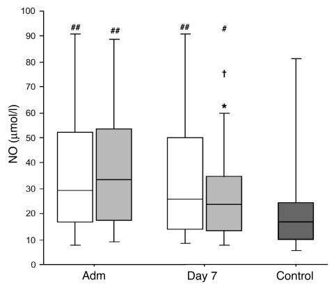
Figure 6.
Serum NO levels. Data are presented as box plots; the central line indicates the median, the box the IQR, and the whiskers the 10th and 90th percentiles. Patients were compared with healthy volunteers (dark gray box; n = 30). White boxes represent the patients in the conventional insulin therapy group (n = 50 on admission, n = 222 on day 7), light gray boxes patients in the intensive insulin therapy group (n = 50 on admission, n = 180 on day 7). *P ≤ 0.05 versus conventional insulin therapy; †P ≤ 0.05 day 7 versus admission day; #P ≤ 0.05 versus healthy volunteers; ##P ≤ 0.01 versus healthy volunteers.

